

Why data viz competitions are good for our industry
But are so tough to judge (which could get even harder with more use of AI tools)

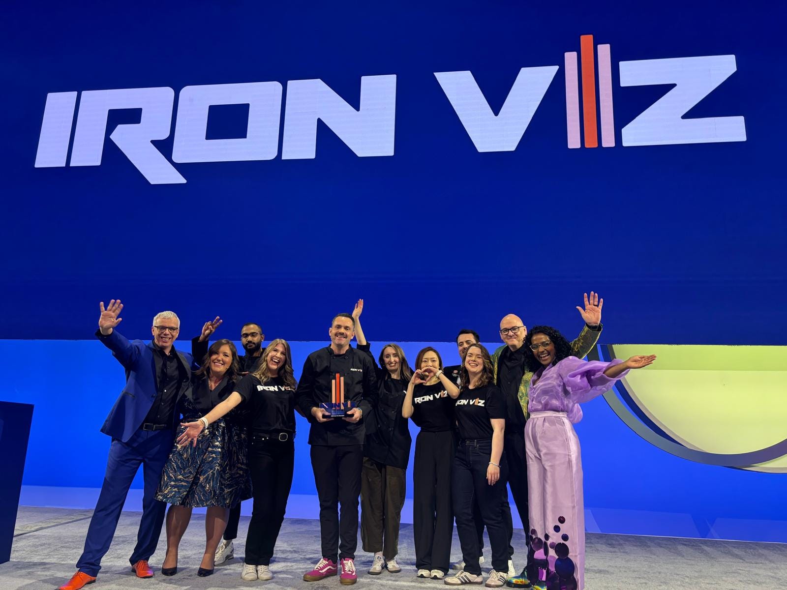
Last week, I had the privilege of judging the mainstage Iron Viz competition at the annual Tableau Conference in sunny San Diego, CA.
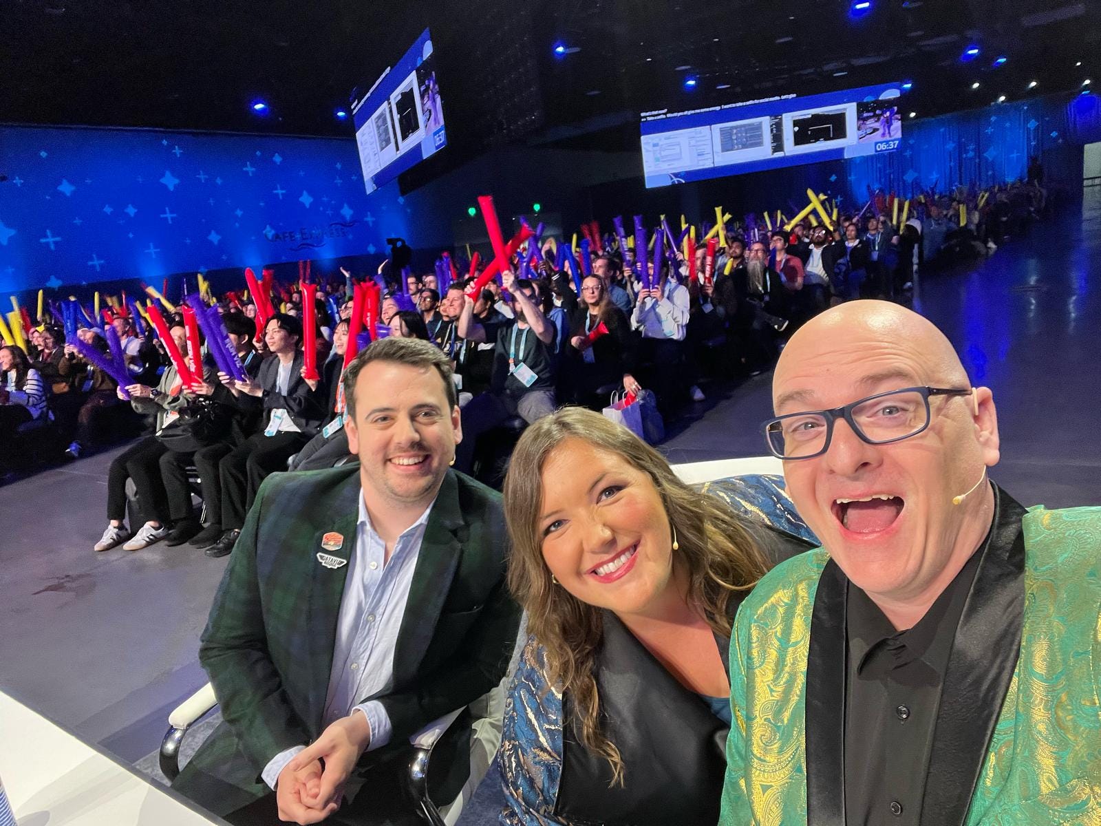
If you’re not familiar with Iron Viz, each year three Tableau designers build dashboards with a provided data set live on stage. Then, they have three minutes to tell a story with their visualizations. It’s high stakes presenting in front of 7,000+ people and always one of the highlights of the conference.
While the main event all unfolds in under an hour, conversations with contestants and past winners pointed to more than 100 hours of prep time before the conference, which is evident in the incredible dashboards they built. If you missed it, you can watch this year’s show on LinkedIn or Salesforce+.
As a judge, I had a lot of folks ask me questions about the experience judging this year’s competition. Those conversations had me reflecting on the process and challenges with judging data viz competitions, and why I still think they’re good for our industry despite valid critiques.
A glimpse into judging
I’ve had the privilege of judging many data viz competitions over the years: the Information is Beautiful Awards, Fast Company’s Innovation by Design Awards, the World Data Visualization Prize, and an Iron Viz qualifier and finals.
The judging process varies across competitions. The most common structures I’ve seen fall in one of three models:
Individual scores, aggregated for a result: Judges receive a clear set of criteria, score the submissions, submit scores, and the totals determine who comes out on top. While this may seem the most ‘fair’ and mathematical, sometimes scores are skewed by getting judges who score submissions high or low in their ratings (which is why having multiple judges review each work is important) and sometimes a judge catches a critical issue someone else misses (like an analysis error or accessibility issue).
Decision by committee: Judges review the submissions (typically at the shortlist phase), discuss which they would select as winners, and come to a collective decision without ever writing down any specific scores. This creates more space for conversation, but discussions can be dominated by people in the room with the strongest (or loudest) opinions.
Individual scores first, then discussion: Judges score submissions according to scoring criteria provided by the organizers, then meet (sometimes for hours) where they get to see all of the scores and discuss who to select as the winner. Sometimes there’s a clear favorite, but other times this approach showcases the divergence in the scoring and creates space for conversation. Personally, I think this is the fairest approach, but has the challenge that it requires the most time (scoring and discussion meetings).
Judging criteria varies too. For Iron Viz, participants know they are being scored on design, analysis, and storytelling, including the stage presentation for the three finalists. For the Information is Beautiful Awards, the FAQs page outlines specific judging criteria more granularly, and there’s a matrix provided to judges to define what each score within a range means.

Listing judging criteria matters: I want every creator to put their best foot forward and get a fair assessment. When we share what we’re judging on (more specifically than ‘good design’) creators can address those criteria in their submissions. Transparency helps everyone: creators can determine what works to submit and address criteria like ‘impact’ in their cover notes, judges know exactly what they’re scoring on, and the community has visibility into the process.
Why data viz competitions and awards are good for our industry
Judging these competitions is always challenging for me because there are so many incredible projects. Objectively judging submissions created through a blend of art and science can feel like an impossible task, even with clear criteria, when you could make a case for anyone in the final stretch to take the top prize.
Some works excel in creativity and design, but the analysis is less compelling. Others have exceptionally deep analysis but have some misses in design. And how much should accessibility and other specific criteria impact the overall decision?
When we were starting up the Data Viz Society, there was heated debate in the community about the merits (and challenges) in data viz design competitions. A few of the many questions that came up included:
Is it even possible to be objective when scoring submissions?
How do submission fees create barriers to entry to those from under represented groups or low income countries?
Do awards perpetuate some of the inequities in our field by elevating those with the time and flexibility to create public facing visualizations?
Do submissions created in languages other than English face a disadvantage based on who the judges are?
Are awards biased towards a particular type of visualization, focusing more on artistic visualizations than practical ones?
How much does name recognition play into selection, where we continue to elevate the same people?
We talked through all of these questions (and more) when evaluating whether DVS should host a data viz awards program. Ultimately, we partnered with David MacCandless to continue the legacy of the Information is Beautiful Awards program which had paused from 2020-2021 in the midst of the pandemic, in big part because of the value to the data viz community in continuing to add to the incredible showcase of submissions.
My own thinking around the value of data viz awards was shaped by many of those conversations, with three key reasons why these competitions are valuable for our industry, particularly as AI image generation proliferates.
Let’s unpack why awards programs are good for the data viz field.
1. Inspiration
Data viz competitions create curated repositories of incredible projects. Because people submit their best projects from a year, we can go to the longlists and shortlists (not just the winners!) to discover incredible projects we may have missed in our content-saturated world.
The Entry Showcase for the Information is Beautiful Awards is one of the biggest repositories we have of data design excellence over the past decade+.
New to data visualization work and looking to explore more creative chart types? Curious about unusual mediums for presenting information? Want to dive specifically into visualization about scientific topics? It’s all right there.
You can also explore similar repositories for Malofej (data journalism) and Iron Viz (Tableau).
2. Education
I teach a data visualization foundations class for the Maryland Institute College of Art Data Analytics and Visualization MPS program. The IIB Awards showcase is one of the first places we point people to in our course, since it’s a valuable teaching tool for showcasing the breadth of works in the world of data viz.
Other competitions use a qualifier approach, providing the same dataset to all participants. Reviewing the submissions with students, you can talk through the ways the same dataset was used to travel many different analysis paths and with many different visualizations. Iron Viz uses this approach, with this year’s feeder competition using IMDB data on TV and movies.

On a very practical note, sometimes projects I point to in my classes and workshops migrate to new websites or even go offline completely. That’s happening more today than I ever would have expected, thanks to the current administration in the US and newsrooms shuttering teams like FiveThirtyEight. Having the project description and screenshots of the work on a central website, like the IIB Awards Entry Showcase, creates a lasting artifact from that work.
3. Recognition
For the individuals selected for longlists, shortlists, and as winners, adding “award winning data visualization designer” to their resume can be a game-changer in their job searches or when marketing their freelance design services. I’ve even chatted with a data journalist who got their first job because a recruiter discovered them on an IIB Awards longlist!
For our industry, competitions showcase the innovation and creativity of data visualization designers to the wider world. While it’s a joy to recognize and celebrate excellence in data visualization among peers, there’s a degree of validation (that we are an industry!) in these competitions when viewed by outsiders.
The future of design competitions
I’m curious to see what the future of design competitions will bring as tools continue to evolve, awards recognize more than just data visualization and venture into data experiences, and we see more integration of AI into data viz design workflows.
In the third installment in her series on the future of data visualization, Shirley Wu points to the Unusual category for the IIB Awards being the place she found the most inspiration, as it included projects where data was represented in sound, physical forms, books, and community installations.
Perhaps the future of our awards programs will separate and recognize different forms more explicitly. But in the meantime, dedicated awards like the Data Sonification Awards have popped up to focus more on these niche types of data experiences. (They have delightfully detailed judging criteria across their categories of Arts, Communication, and Analysis!)
My longer thoughts on AI in data visualization are more than what belong in the wrap up of this note. When considering eligibility for awards, where should the boundary be on how much AI was used in the design process?
Visualizations created wholly by prompting a genAI tool feel like they should be disqualified to me, in big part due to the ethical concerns around how underlying models were trained based on stolen intellectual property from images to books on data visualization design.
But if AI tools were used for brainstorming in the early stages of the process? Or in generating ideas for color palettes or other components? Is that just using the technology and resources available to use in ways that serve our own preferences around our design process?
This year, the IIB Awards submission form included a field for people to disclose if/how AI tools were used in the creation of the work. Like most submission information, we’re relying on self-reported information, and as AI tools get increasingly integrated into the software often used for data visualization, we may leverage those capabilities without even realizing we’re doing so which starts to muddy the “what should qualify?” waters a bit more.
Even with the big changes in how we do our work, awards programs will continue to have relevance in our industry. But for those of us privileged to judge these competitions, judging conversations will become even more challenging as we consider how to weigh how much the human part of the design process plays into selecting the winners.
The Information is Beautiful Awards 2024 shortlist was announced last week if you want to explore some of this year’s favorite works! You can also join the IIB Awards Ceremony live in Miami as part of this year’s Outlier Conference hosted by the Data Visualization Society with Alberto Cairo’s Open Visualization Academy.
I really appreciate calling out inspiration, education, and recognition as important for the data viz community! I’m not sure competitions are the only way (or the best way) to achieve those goals.
My main concerns mirror some of the questions you wrote about:
1) Judging is always more subjective than objective, especially around criteria like "creativity" and "beauty". Competitions, however, implicitly support a sort of zero-sum framework with winners and losers (even if we know it's all subjective). I worry a bit about what that signals, especially to newer folks who might not yet see data viz as the creative and expressive field it is. There’s a subtle but important difference between “these judges didn’t find my piece as creative as X” and “my piece isn’t creative.” Competitions tend to blur that line just a bit too much for me.
2) Competitions can tend to reward sameness. As Shirley Wu pointed out in her great post that touched on scrollytelling fatigue, awards may cause a convergence in the types of work we consider excellent. We see this dynamic in web design too (i.e. awwwards.com), where specific types of projects almost always tend to get featured.
All that said, I can recognize that any alternative approach to competitions will have their own tradeoffs. For example, an industry-wide "Project Of The Day" might not be as much of an event as an awards competition is. How we weigh those tradeoffs is subjective, and that’s okay.
I’m glad that so much thought is put into the data viz competitions that I've entered or followed. And also that the data viz community continues to invest in non-competitive ways to spotlight great work (like how accessible it is to pitch something to Nightingale!).