

Headlines, charts, and polling data in the Wisconsin gubernatorial primary
Notable chart design moments in an ever-changing primary field

When I think about common times when we collectively look at charts, COVID comes up as a historic example. Weather data for daily life. And election data as we track candidates’ chances and favorability of issues that play into electability.
This week, let’s talk about election charts that I’ve been spending way too much time browsing as a Wisconsin voter and data nerd.
About the race
The Wisconsin democratic primary for governor is coming up on August 11. One of four candidates still in the race will go on to face Republican Tom Tiffany in the general election in November.
But the last few weeks have been a wild ride if you’re a Wisconsin voter. We’ve had two major polls in July from Marquette and State Navigate/Main Street Alliance/Up North News. Both happened before the debate on July 28 and before additional departures from the race.
Some of that data has been buried in long tables, but there have also been some interesting charts that address data communication challenges common in elections and other survey data:
Undecideds have remained a large response group, resulting in seemingly simple but highly impactful choices around where to rank the undecideds on bar charts.
Second choice preferences are particularly important when candidates drop out in the middle of or after a poll, creating one of the best uses of a Sankey chart I’ve seen outside of finance and budget data.
Sentiment reporting, including favorability on issues and candidates.
In theory, everyone should vote for the candidate they want most. That’s the real point of having a primary.
But charts have the power to sway perceptions around electability and issues. As you read through reporting in this mid-term cycle, consider how you’re using the data as a voter, which may be different than how campaigns use the data to shape messaging and fundraising.
The changing field
I’ll get to the charts in a moment. It’s helpful to have a bit of context on the timeline of events over in the last month if you’re outside of Wisconsin and haven’t been following the shakeups.
A month ago, we had six candidates still in the race. Then…
David Crowley (Milwaukee County Supervisor) dropped out and endorsed Sara Rodriguez (current Lt. Governor and winner of the straw poll at the WisDems convention). (WPR)
News surfaced that Rodriguez’s campaign had some financial inconsistencies with less cash on hand than reported.
Crowley re-enters the race.
The only official debate happens with five candidates on stage.
Former Lt. Governor Mandela Barnes drops out, with no official endorsement of any of the remaining candidates.
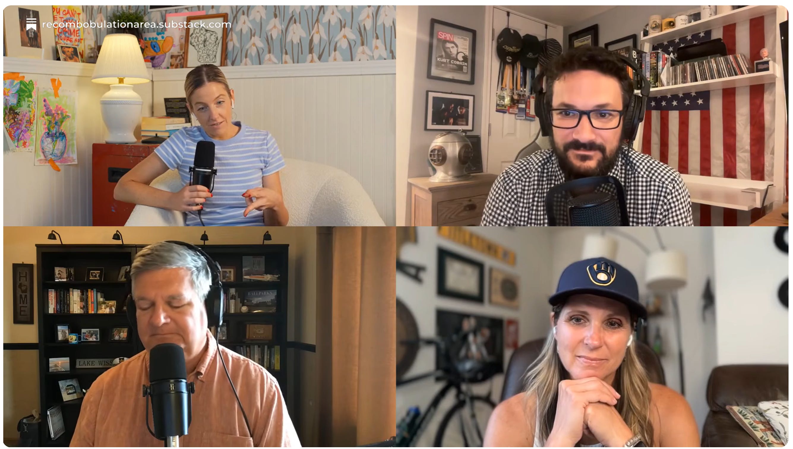
There’s a crew of four political creators who have been doing amazing ‘group chat, but on YouTube’ discussions about the state of the race if you want to dig into the details of the last few weeks.
So a week from the election, we have four candidates still in the hunt, with Francesca Hong (WI State Assembly member) far in the lead in the polls and gaining national attention with coverage in the NYT, Washington Post, and more as a democratic socialist leading the race for governor in a swingy state.
The other remaining candidates include Kelda Roys (WI State Senator), Joel Brennan (former WI Secretary of Administration), and Crowley.
With that context, let’s unpack a few notable charts and design decisions.
#1: Reporting on undecided voters
Over the last month, undecideds have remained a large response group. So what’s the best way to represent them in poll reporting?
Remember: sort order often shapes the story on bar charts.
Many poll charts have followed the common convention of sorting an ‘other’ or ‘don’t know’ category as the last bar in the chart (below, left). This approach focuses our attention on who is leading among the candidates.
But when nearly half of voters remain undecided, that group may be the story, as we saw in the results from the mid-July Marquette poll.
To focus attention on the large share of undecided voters, moving that category to the top of the chart focuses attention on the potential for change. Adding a clear headline and highlighting with color focuses attention even more (below, right).
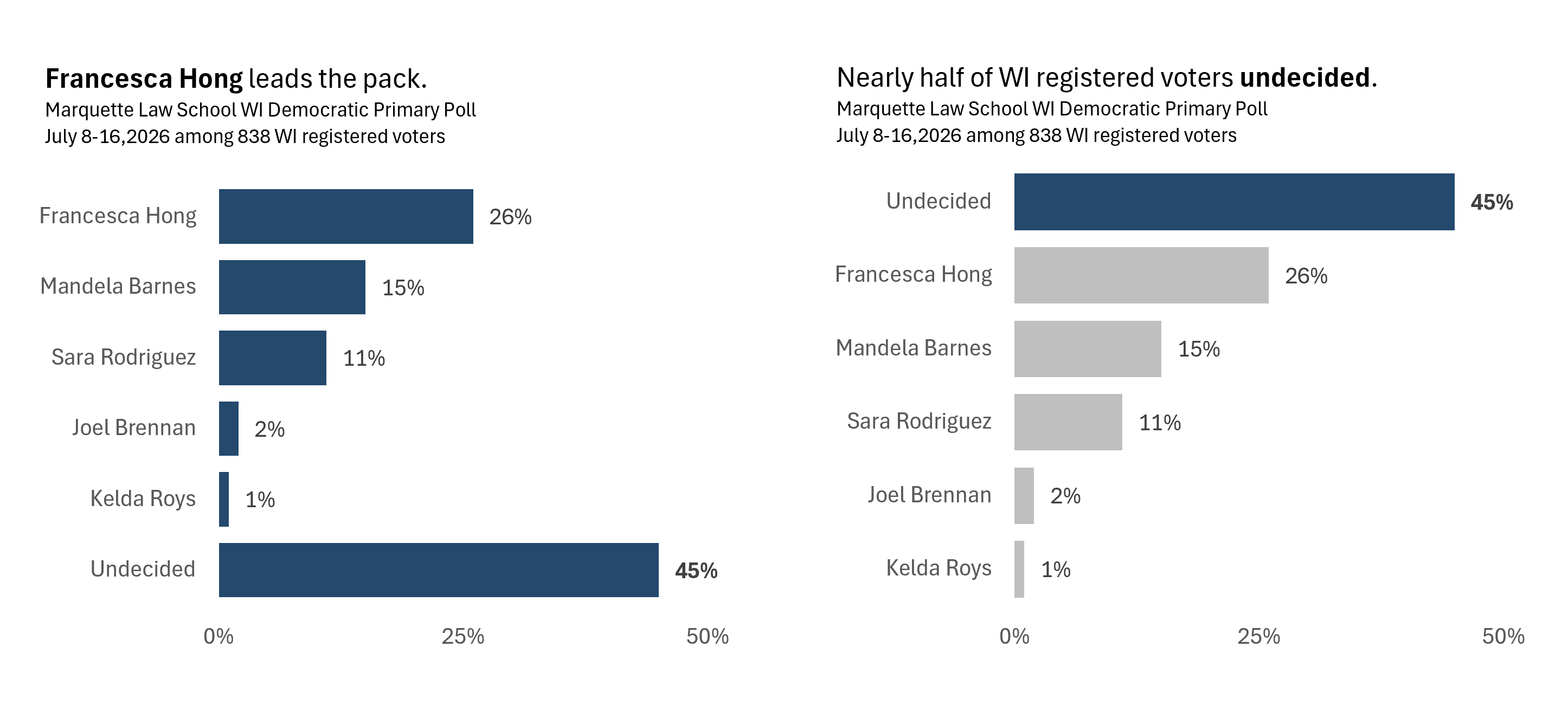
When the share of undecided voters is larger than multiple candidates, my personal preference is including undecided ranked in the mix (right) since they’re a large and important block.
#2: Plotting second choices
When we’re in a general election, candidates don’t change often in the window leading up to Election Day. The two major parties pick their candidates, and you may have a few other options on the ballot.
But primaries are bigger, more crowded fields with candidates exiting on an ongoing basis. Adding to the complexity, candidates may drop out when early voting has already started. As a result, some voters may have cast ballots for non-viable candidate, which is one of the best cases I’ve seen for rank choice voting.
Peek back at the bar charts above of the Marquette data: the second (Barnes) and third (Rodriguez) ranked candidates are no longer in the race. (Plus, another candidate—Crowley—returned to the pack who wasn’t included in the poll.) So where are supporters likely to shift for Barnes and Rodriguez?
The more recent poll from Up North News, Main Street Alliance, and State Navigate dedicated time in the reporting to those second choices.
In their poll, conducted July 23-26 among 1,085 likely voters, Francesca Hong led (44% of likely voters). But the data on second choices for Barnes supporters become very relevant when he ended his campaign. A quick look at that support looks like another boost for Hong, which is what comes out in the recalculation of support.
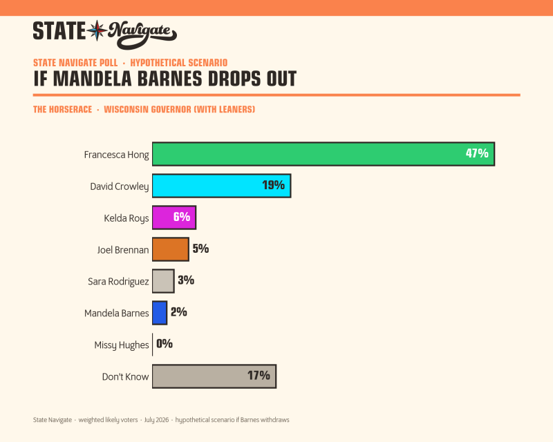
The precision of the bar chart is really helpful for looking at who stands to gain the most from Barnes’ departure, but State Navigate’s Sankey chart is a standout among the poll charts for me.
You can see the flow between candidates, it’s visually engaging, grabs your attention, and rolls up the totals for potential additional support. And the clear ranking on both the left and right based on share of the vote makes it easy to quickly look for who’s leading now and who has the biggest potential gain from other candidates’ exits.
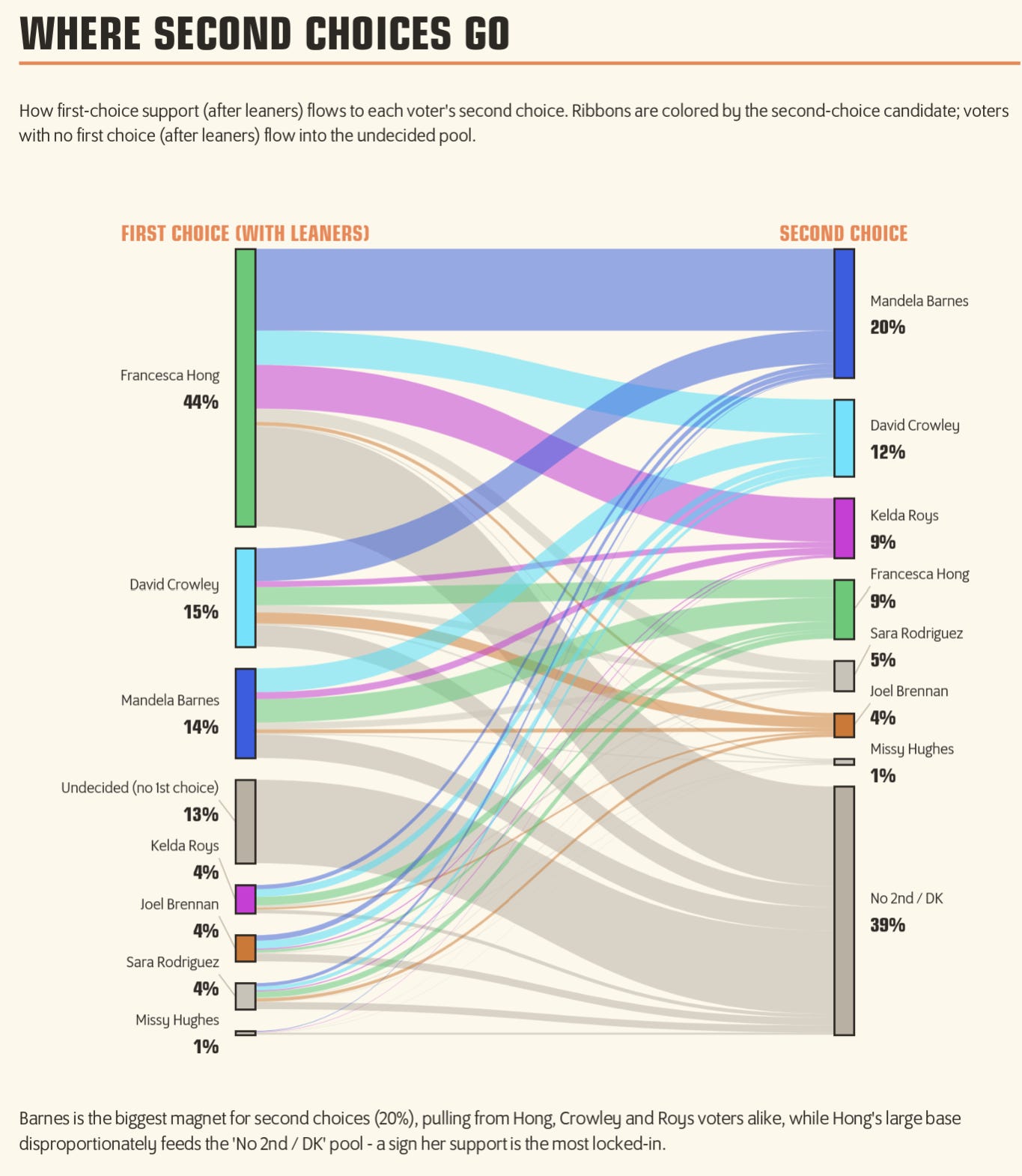
What the Sankey doesn’t do well is show the detailed distribution of where supporters go when a single candidate drops out. Great chart for engagement, less for precision.
The whole report is really well done, particularly their consistent use of color for each candidate so you can follow one candidate across charts. Take a peek!
#3: Reporting on issues that impact electability
Polls about candidates aren’t the only ones that shape opinions and behaviors of voters though. Issues matter too.
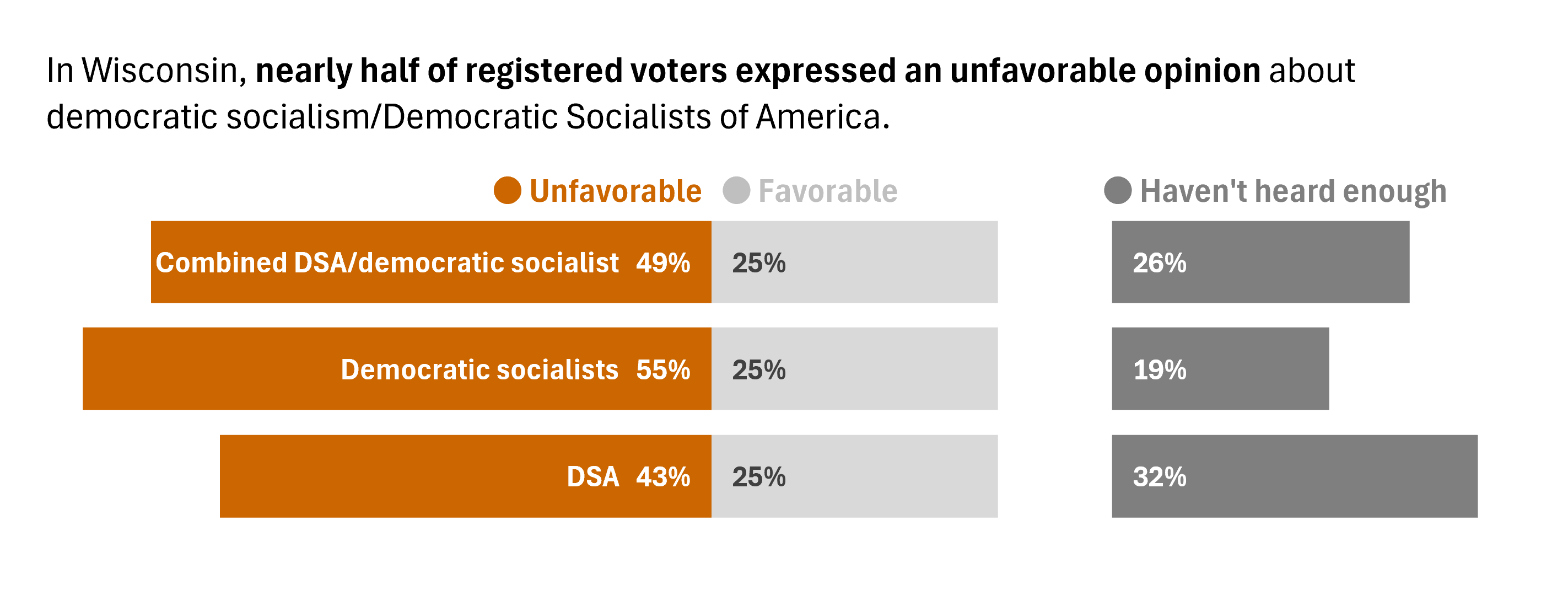
The July Marquette poll included some issue-related questions alongside respondents’ candidate preferences. With Hong leading in the polls, the big one that grabbed headlines asked about perceived favorability of democratic socialism and the DSA as a party.
When we ask for favorable, not favorable, and undecided responses about an issue, my go-to is a diverging bar chart. Diverging bar charts are great for showing shifts in sentiment across categories, and have an implicit ‘negative / positive’ direction that relates to our mental model for sentiment.
One drawback is that diverging bars don’t put the two categories on an aligned scale though, so estimating the difference between favorable and unfavorable is a bit more work than on a dot plot.
But back to the theme of undecideds: where do we put the share who need more information? Steve Wexler, who is one of the industry experts on survey data design, has written about the benefits of splitting the neutral category out separately, as seen in the charts below and and it’s an approach I use often.
Who is represented in the data is important too. Across the Marquette poll, the results includes a mix of data for registered voters and for Democratic voters.
If want to assess what the overall favorability of an issues is across the full voter base, including independents, looking at all registered voters could be useful when considering electability for Hong if she wins the primary, as in the chart above.
But there’s probably a reasonable share of people who hold an unfavorable view of democratic socialism AND are not going to vote for the Democrat no matter who the candidate is. So perhaps we look at democratic voters only, including considering their political leanings.
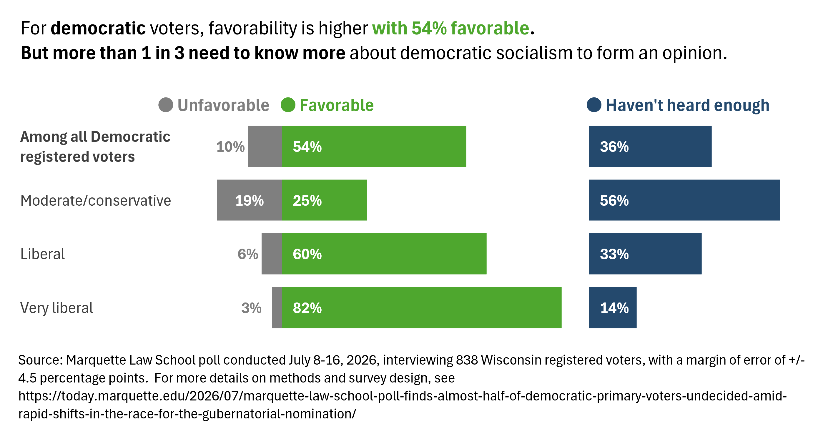
The additional data I wish I had to make sense of this chart is how large each of these subgroups are, but a girl can only dream.
So why do charts on issue favorability matter? Will people change their opinion about something like democratic socialism just because they see others like them have a positive opinion?
Maybe.
Eli Holder, an exceptional data viz researcher and communicator, has explored the effects of seeing charts of opinions aligned to different political ideologies. In a recent study, key findings from research on public opinion polling, the two big findings were:
Public opinion visualizations have a social conformity effect. Charts showing that an idea is popular can make the idea more popular. When viewers saw that certain policies were popular with their groups, the policies became significantly more popular with the viewers themselves.
Visualizing polarization can make it worse. For specific types of charts, these social influences can take the shape of polarization. When viewers see that attitudes are polarized by party, their own attitudes become more polarized across parties.
Functionally, that could mean that seeing overall favorable opinions of democratic socialism could pave a clearer path for Hong. Or, that seeing unfavorable opinions could make the road tougher, particularly when trying to persuade conservative-leaning or independent voters.
I have no crystal ball though, and a lot can change day-by-day on a campaign. I’m here to talk about charts, not make political predictions.
If you’re a data nerd or even vaguely curious about how visualization research is conducted, Eli is one of the best in the field at creating plain-language explainers about his work, including the details behind the opinion polling research.
The lesson: be mindful with poll data.
Discussions around ‘is it even worth voting for my candidate’ keep surfacing as Hong pulls an increasingly wide lead in the two July polls.
My opinion? Yes.
All of the static charts we see in the news and on social feeds can create a sense of certainty in the polling data. But polls don’t vote, people do.
Want to make the case to yourself that polls can only tell us so much?
The analyst at Badger Brief has put together an interactive tool to play with the WI primary polling data, where you can decide what goes into the model. Dangerous if you’re trying to make predictions, but there’s a very specific disclaimer: “This is not a predication. It combines public polls into one picture and shows how much is still uncertain…The movement is the point.”
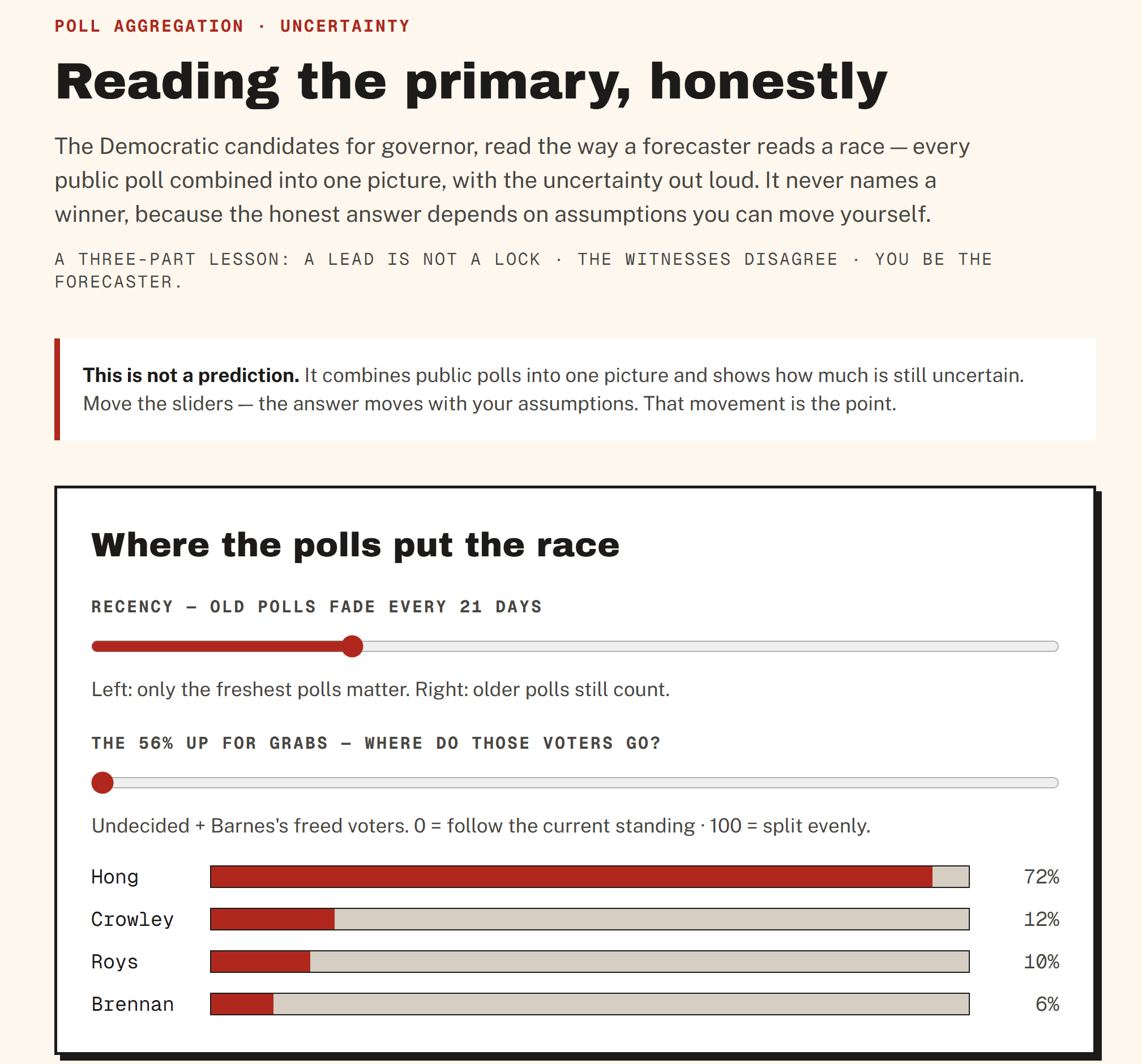
Interactive tools shine with ways to emphasize how different weightings of inputs reshape projections, more for entertainment than anything else. But the section of the forecasting tool I appreciate the most are the caveats at the end: “Is this legit?”
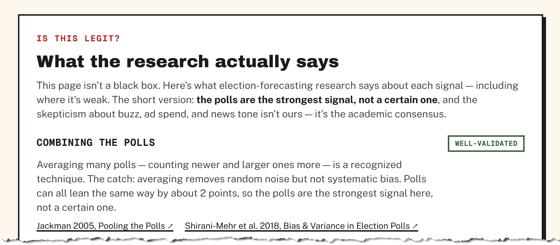
That’s visualizing data responsibly in my book: giving the context and framing someone needs to interpret the data, which is just as important as the chart design.