How data communication in airports can help anyone be 'a data person'
Seeing data in the wild during summer travel and how it shapes my thinking as a data viz designer

I was on travel last week to celebrate a friend’s milestone birthday. Nerd that I am, I’m always curious about how airports communicate data.
Using data in real life
Part of that curiosity stems from thinking though where we encounter data in our daily lives. I write a lot about charts in public health, data journalism, and other professional contexts, but the reality is that those are often for somewhat specific audiences.
More often, people will engage with data on wearable devices like an Apple watch, on weather apps, or when making decisions about getting from point A to B.
Consider travel, which requires a lot of decision making with numbers, even if you don’t think of them as data-driven decisions. Flight at 9AM? Just figuring out what time to get the airport, you might consider:
how long it takes to get to the airport
how long parking and getting to the terminal will take (if you’re not using a rideshare, train, or bus that drops you at the terminal)
how early you prefer to be there
whether you have bags to check or not
how long security usually takes
whether you’re taking a domestic or international flight
Then you calculate backwards from your departure time to sort out when to leave your house. Once you’re there, you relay on information on flight status boards, airline apps, and signage to make it to your gate in time.
Three ‘just the numbers’ examples
While I love a great chart, the signs used for communicating information for people at airports are better suited to simplicity and often feature numbers or plain language to describe a number (see example #3).
Think about who the audience is: someone rushing by as they hike to their gate at the airport, not a captive audience reading a long article on the plane.
Here are three simple examples from my flights between Milwaukee and San Francisco and what they made me think about as a data viz designer.
Wait times
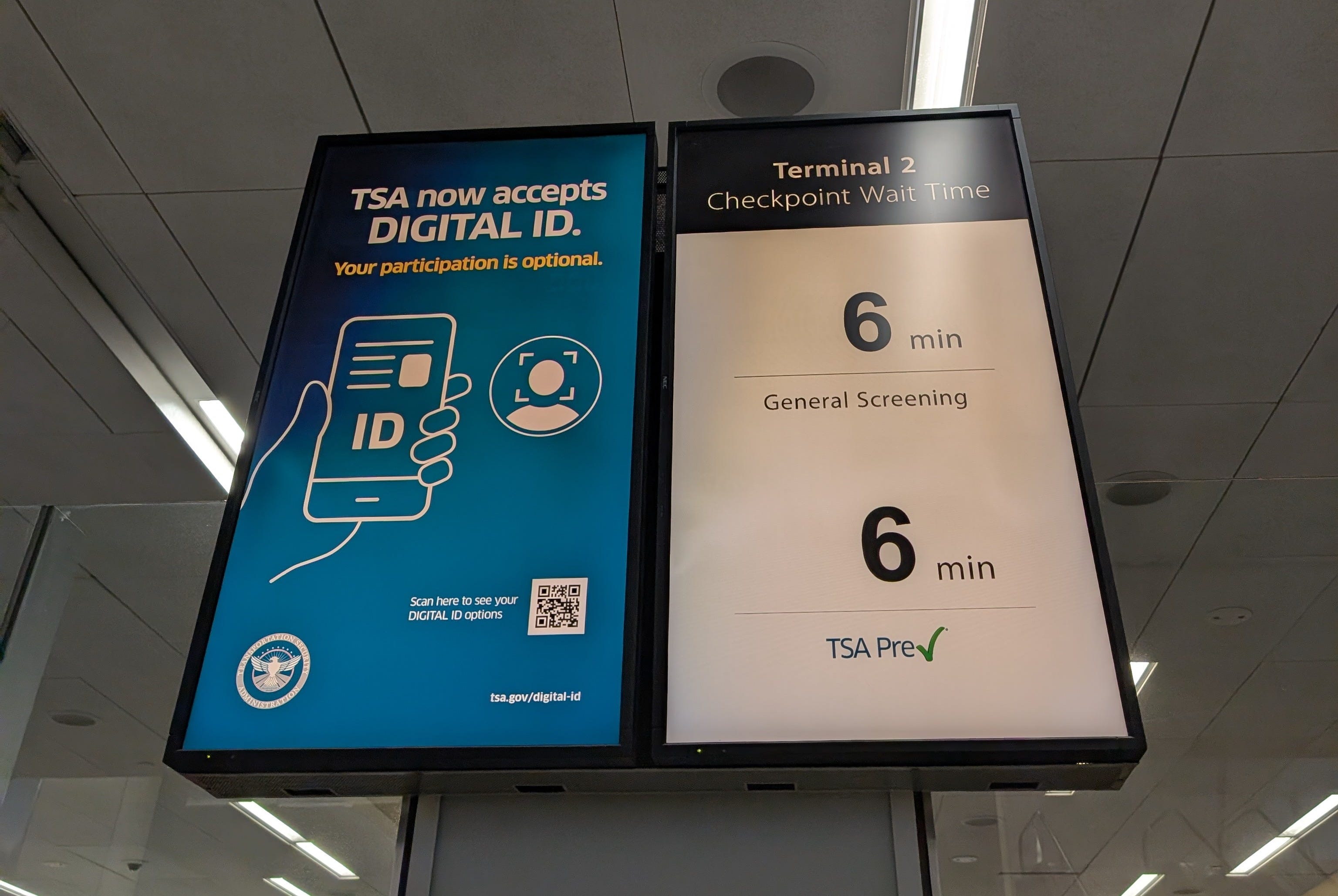
I love this board at the security checkpoint. What information do we need at that point in our journey? Some estimate that tells us if we’re on track to be through and to our gate on time.
Lately, I’ve seen TSA Precheck lines longer than standard security lines as more people get approved for the expedited process. But the length of the line doesn’t tell you time; Precheck tends to move faster since passengers aren’t unloading electronics and are often seasoned travelers. And we don’t need anything more complex here than a simple number.
Cost of repair
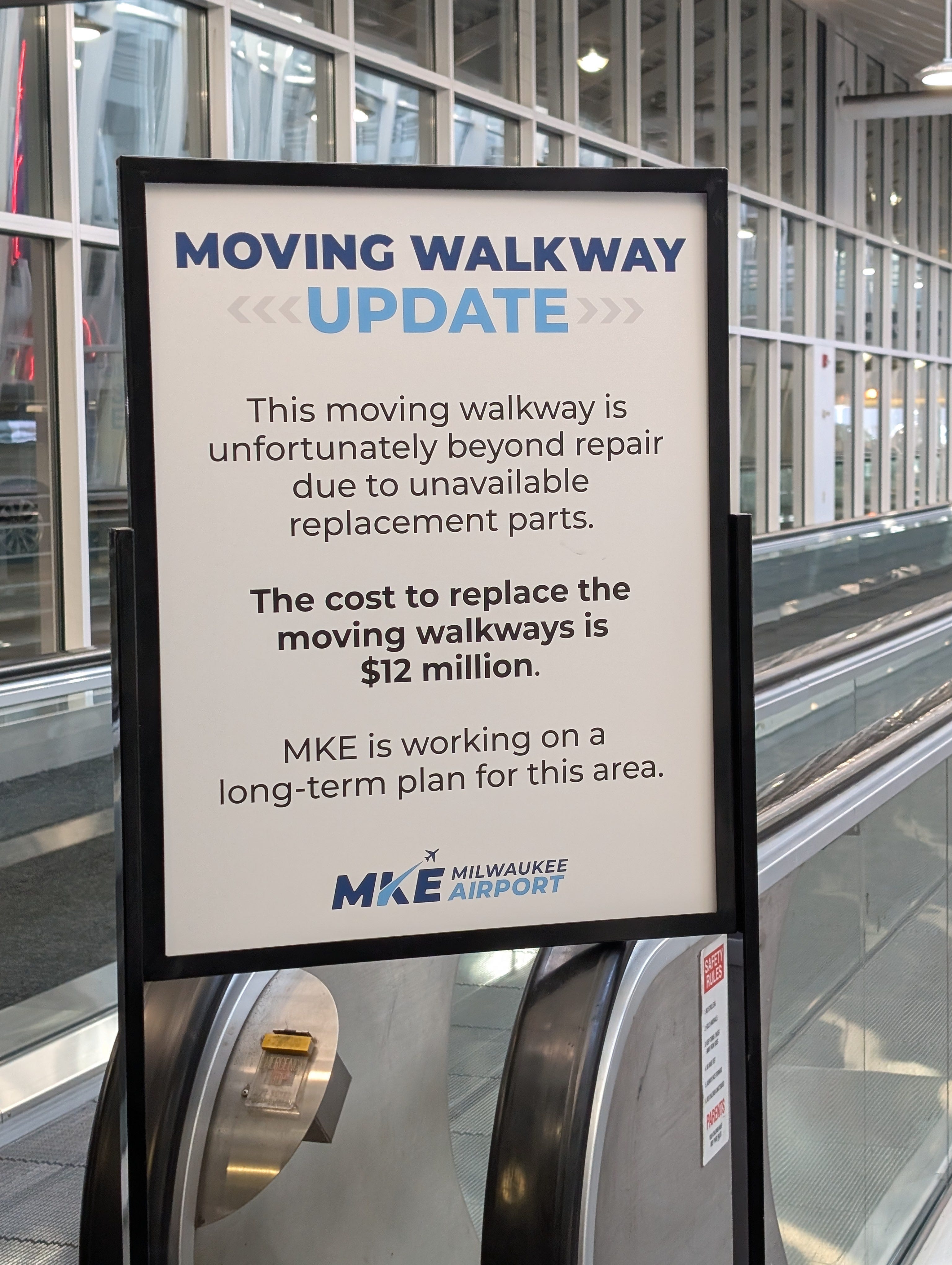
The moving walkway from the daily parking structure to the terminal has been out of commission for some time, and appears it won’t be back in motion anytime soon. Inconveniently, it’s the moving walkway towards the terminal when you may be in more of a rush, leading to some frustration for delayed travelers.
I love the transparency in this sign sharing more than just the status of the repair: to make the repair would cost $12 million dollars. That’s more than most people (myself included) would estimate a moving walkway to cost.
More visibility into our public works project costs can help cultivate some empathy for the cost-benefit decisions made every day that impact how we move through the world.
Transit times
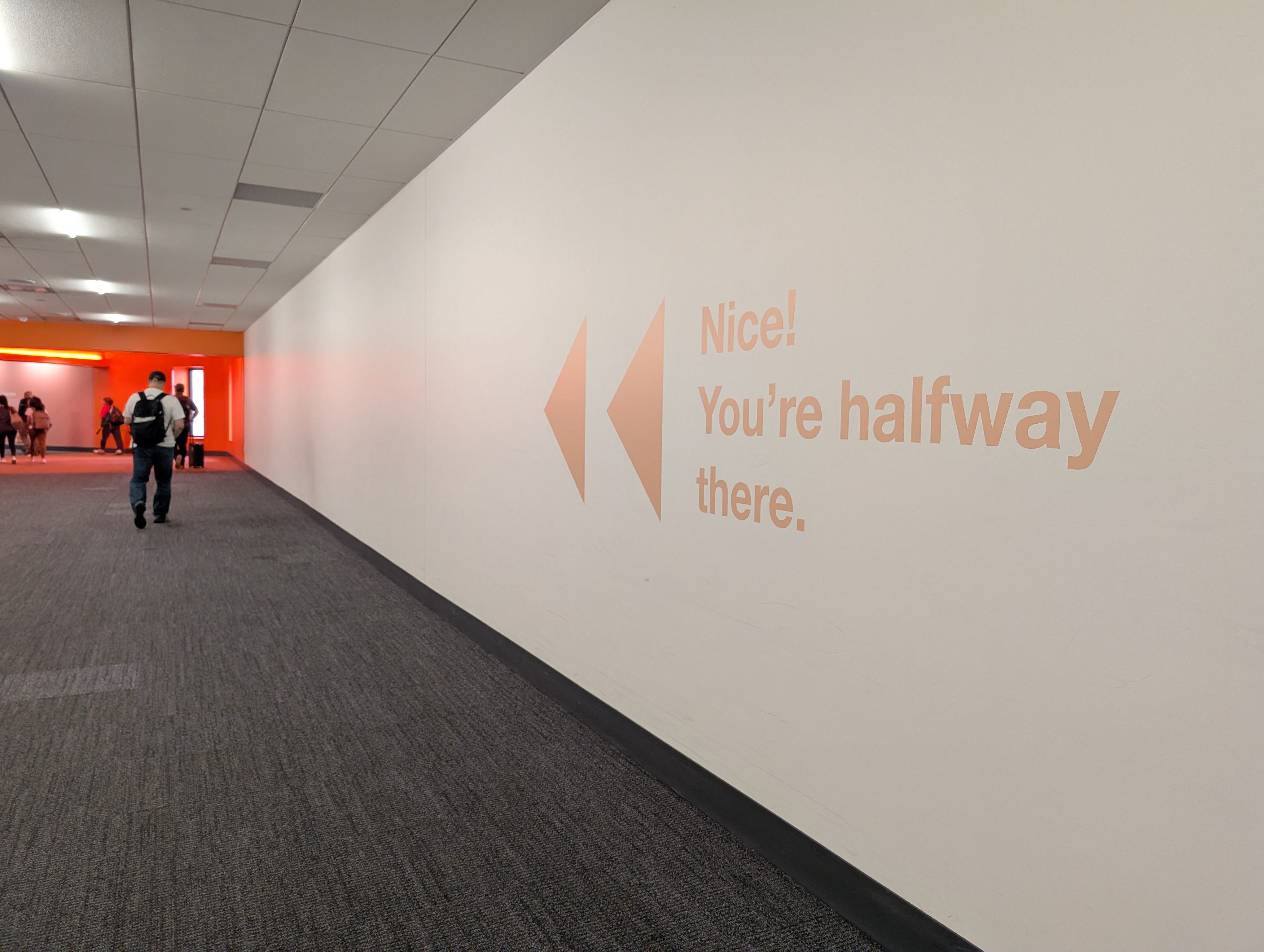
Rushing between gates to make a connection or just trying to get from security to your plane?
When you’re walking along a terminal, the gate numbers often give a sense of how far you’ve gone. If I started walking at gate B10 and need to make it to B40, I can see the gates and how far I’ll need to travel.
But in hallways between terminals in unfamiliar airports? That can feel endless, which is a point of concern if you’re tight on time and need to know how quickly you should be hustling to make it to your gate in time.
I loved both the encouragement (“Nice!”) and the plain language time details (“You’re halfway there.”) on this wall decal between terminals. I’ve seen similar details on flight boards that show destinations, flight numbers, and the estimated walk time to a gate, but never quite know how my own walking pace will stack up to the estimates.
Signs help make anyone a data person
While complex graphics may be better suited for ‘data people’, signs like these help anyone understand and act on information. When someone tells me they’re ‘not a data person’, I love to chat about travel and weather apps, which help demystify data.
As a data viz designer, observing how we engage with information as we navigate the world is a valuable source of inspiration. Simple signs are also a reminder that we need to consider our audience and their information needs when we’re designing more complex visualizations. Where are people encountering our charts? How much time do they spend with them to glean insights? What information are we looking for?
Particularly when I’m working on dashboards, I find designers try to pack in all of the information possible across many tabs and views. But if we instead focus on serving up the information someone needs most, we’re more likely to help them along their way to a decision and create a more useful product (even if it shows less information).
Bonus: visualizing wine
The vacation destination last week was wine country. Imagine my delight when I found one example of data viz in the wild at our last tasting.
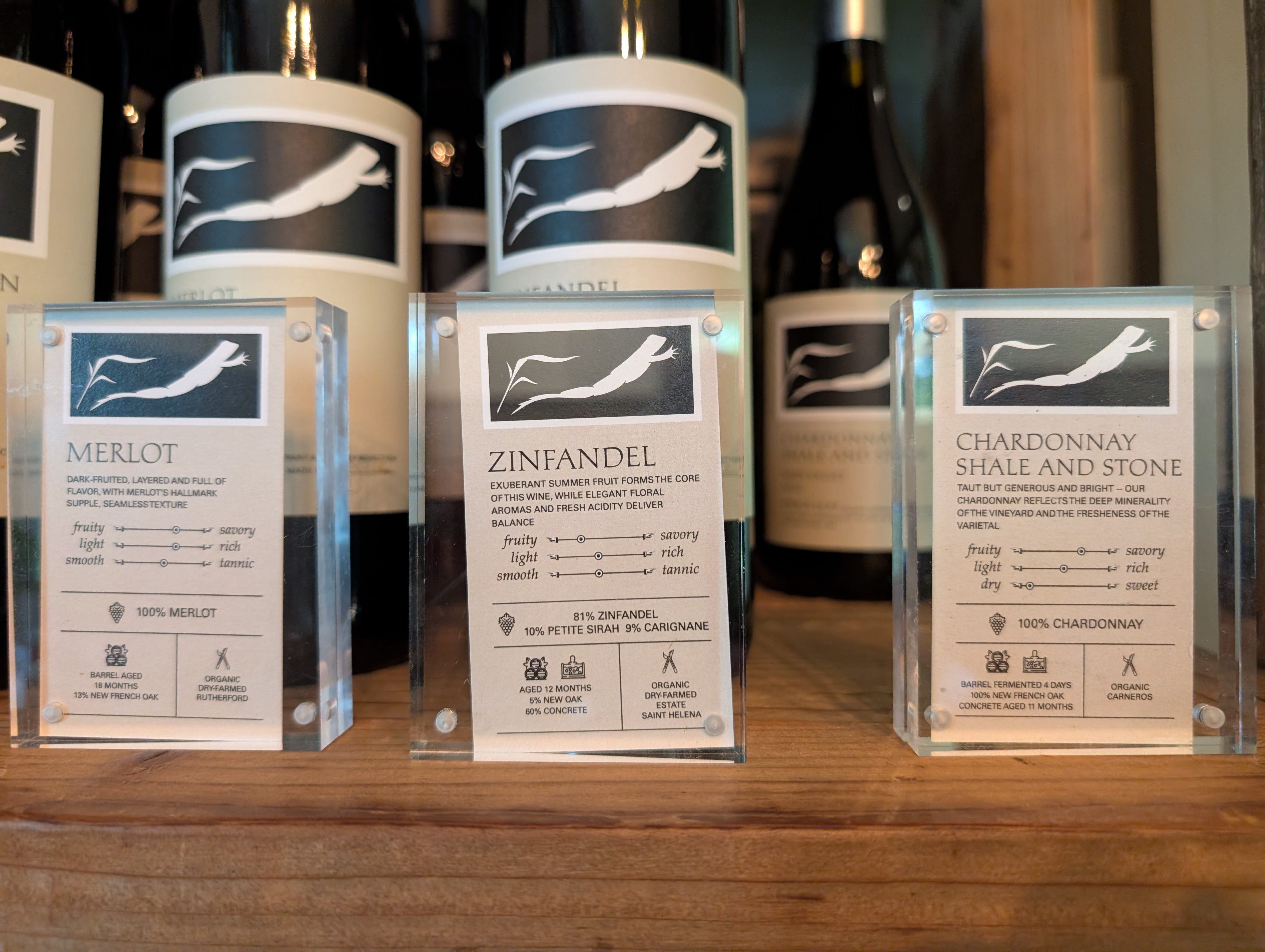
The signs above sat in front of each bottle at Frogs Leap. The signs communicate information about the flavor profile of the wine, identifying where the wine sits across the scales of:
Taste - from fruity to savory
Body - from light to rich
Tannins - from smooth to tannic
What I love about these little continuum plots is the abstraction. We even use them as an example of a discovery tactic for making sense of how audiences are different in Dashboards that Deliver.
Instead of rating along numeric scales or with other units, they communicate information about the flavor profile of the wines between different common characteristics in wine. This could make it easier to compare across varietals and make selections, even if you didn’t taste each bottle. In contrast to the specific numbers at the airports, these were all about relative scales across bottles.
Even when I’m on vacation, I can’t seem to turn my data brain off. I hope you’re feeling inspired to observe more ways you see numbers communicated out in the world, and bring some of that inspiration into your own data communications.
I’m enjoying more offline time over the summer with recent travel and quality time with my kids. As I mentioned in a recent LinkedIn post, hobbies that pull me away from screens and into the world of making things (like cooking) are bringing a lot of joy now, so this newsletter will continue be a bit sporadic through the summer months.